Categories
PhD Thesis Visualising ESL

Visualising the PhD journey: once you start looking for metaphors…

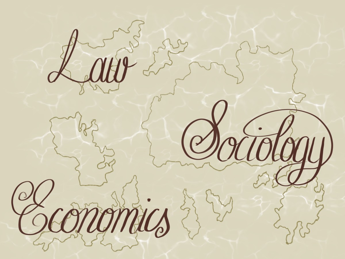
A little heads up on a current (soon to be revealed) WIP: I’m visualising the PhD journey using digital paintings, maps and interactive story-telling. It’s an exciting project and I can’t wait to share it when it goes live. This means that I’ve been thinking about metaphors and ways of storytelling. And it turns out that once you start looking for visual metaphors, they turn up everywhere.

My own personal metaphor for undertaking the PhD was pretty mainstream, despite being invaluable. For those who don’t know, I’ve been climbing a mountain whilst doing the PhD. Passing the viva was effectively reaching the summit, but on the way were a whole bunch of added extras, from being caught in an avalanche (loss or illness), so taking shelter in a cave while storms raged (fighting my university for access and not feeling able to go on), to getting stuck in a swamp and totally lost (doubting that my work was valuable, relevant, or particularly insightful).

Whatever was happening in my life at the time, there was a convenient metaphor for it, and one that helped me put my problems into a tangible frame where I could appraise their significance (objectively), figure out a plan, and then refocus on my goals. I think this is why I found the metaphor so helpful, and why it was it one of the keys to me completing the PhD after 8 years of hard slog. Having that mountain in the distance meant that, regardless of what happened along the way, I never lost sight of my goals and was able to appreciate the storms for what they were; temporary blips that would not permanently interrupt my progress.

Sky: Children of the Light

While my forthcoming project is designed, painted and written by me as a visual representation of my metaphorical journey, I stumbled upon a different version of the metaphor… scrolling through the latest games on Apple’s App Store, I came across a game called “Sky: Children of the Light”. Here are some screen grabs from the App Store, mainly so that you get an idea of the beautiful artwork in this game.

The aim of the game is to get to the top of the dangerous and dark mountain (sound familiar?) and this is best achieved by working altruistically and making friendships (also familiar – no one ever finishes a PhD by working alone). The graphics are undeniably beautiful, and the challenges include decoding glyphs and meeting ancestors to gain their knowledge as you go along (also, very relevant for a PhD journey, although less literal when those ancestors are in book form in a library).

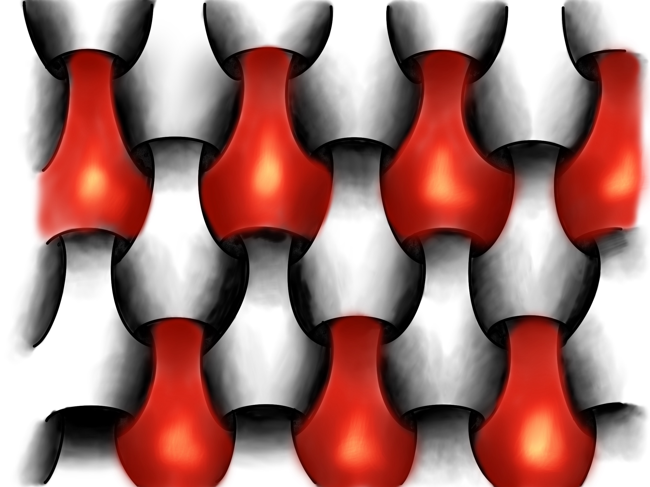
The blurb about the game states that “with your trusty candle, you’ll illuminate the world bit by bit, pushing back the darkness and igniting beacons to open doors to new areas”. This might be a little poetic, but is a comforting thought to those of us trying to develop new knowledge that might just make the world a better place, one day.

“You’ll meet dozens of ancestors who will teach you new expressions – like setting off a dazzling fireworks show – or offer items like capes, hairstyles and musical instruments”. While no one offered me a hairstyle throughout the PhD, learning from ancestors, mentors and peers is a central part of the process. Despite the journey being solitary and even lonely at times, the most valuable resources are the people around you – your cheerleaders.

“Although you can play Sky alone, the experience truly comes to life when you connect with friends, family or strangers. Can’t reach a hidden cliff? Signal to a passer-by who has a more powerful cape and perhaps they’ll take your hand and escort you up. The desire to help others is woven throughout the game’s fabric.” There have been many occasions when I’ve benefitted from the generosity of others in my field. Progress doesn’t happen through sheer slog in the library, but from friendships, kindness, and solidarity. And some beautiful metaphorical scenery.

Categories
3D interactive methodology Visualising ESL

ESL in 3D (the first steps)

What if we could visualise frames and concepts in 3D and move around to see the impacts of those frames?

With the help of a little 3D modelling software called Blender, this is possible.

How can we visualse a frame – literally and metaphorically?

This is the very first step towards making a 3D version of my thesis. There is a lot more to learn, and a lot of work to be done, but the possibilities here are extremely exciting. Currently, this is compressed and uploaded as a GIF, meaning that the sequence is shorter, the frame rate is reduced and there’s quite a lot of noise. But you get the idea… what if we can visualise the frames, concepts and theories that we talk about in the social sciences? How could the visual assist in exploring how we do, talk, and think about law and economics?

Categories
acoustic jurisprudence economics Embeddedness methodology methods Research Visualising ESL

Diving in to an ESL frame…

This mini animation, with sound, asks what the reintegration of the economic, legal and social might look like and sound like.

This is relevant for each and every interaction that occurs – there are always legal and economic aspects to every interaction, but we tend to forget that talking about the legal and economic in isolation from the social is a metaphor, or fiction.

How might we think about integrating legal, economic and social phenomena conceptually?

How could frames or lenses like ESL help us to remember the social basis for any legal or economic aspects of interactions?

Categories
Development economics PhD Procreate Research Uncategorized Vignettes Visualising ESL

Making research relevant: Meet Ann, Pol, and Lil

One of the biggest challenges for anyone working on conceptual issues is making their research relevant to everyone else. After all, the first question any researcher should be asking themselves is “who cares”? This is not the passive-aggressive, somewhat depressing question that it could be, but rather a positive nudge to any researcher to bear in mind why you’re doing the research, and who is going to benefit from it.

My research is primarily conceptual, but has three main audiences: academics engaged in sociolegal research, policy makers working in international development, and a lay audience seeking more innovative responses to the financial crisis. Using designerly approaches to make the research tangible and visible, this post puts a face to each of these groups. Let’s meet each in turn.

Introducing Academic Ann…

Academic Ann

Ann works at a university as a law lecturer. She is researching the importance of the legal system for any country wanting to attract foreign investment. She is planning a trip to Sri Lanka – her target country for research – and is going to talk to government ministers, business people and investors, and local communities around investment zones. But how should she frame her research? How can she hold the interests and views of such a wide range of people in one frame at the same time?

Introducing Policy Polly

Polly has been working at an international development institution for several years now. Her job requires her to use existing research to make policy recommendations for foreign governments, international agencies and charities. She wanted to work in development to reduce poverty, but has become disappointed by the lack of tangible impact her work has, and has been wondering whether there is an alternative approach to understand the causes and ways of addressing poverty.

Introducing Lay Lillian

Lay Lillian

Lillian is not an academic. Nor does she work in development or policy. In fact, she is a retired dinner lady and pillar of her local community. She doesn’t know much about “the law” or “the economy”, but she cares about her community, and knows that something isn’t working properly. The economy crashed in 2008, and a decade of austerity was rolled out. She was told that there was “no more money” and that budgets across the country needed to be cut. But while her community saw centres close and support disappear, she noticed that the rich continued to get richer. So, she began reading about the crisis, and noticed that there were a lot of people arguing that we need to “do” economics and law differently. Lillian is an interested bystander, and wants to know more.

Why the characters? Personae can be a useful tool for exploring research concepts. We can see the relevance of concepts and frames for our own lives. They can make the conceptual visible and tangible.

Each of these will be developed in future posts, and will each bump up against the limitations of the ways we currently do, talk, and think about legal and economic phenomena. Each of them will then try an ESL lens using embeddedness and then moving beyond embeddedness. Through their eyes, we can explore the benefits and drawbacks of reframing in different contexts and for different audiences.

In the meantime, these characters are by me, using ProCreate on an iPad. They are rough first drafts, and the characters will be developed along with their stories. Copyright 2020.

Categories
economics Maps Research Visualising ESL

Maps and mapping…

Sean C Jackson is an artist who draws maps and mazes. The Guardian featured his work recently, and you can see it here. His maps are mostly imaginary, but ask the viewer to dive into the world he has created and puzzle through it. Most of the works sit somewhere between 2 and 3 dimensions, which can make for some disorientation at times, and asks you to engage with the work by turning either your head or the page.

Topography and mapping can be useful ways of visualising ESL, interactions, and social phenomena. Like a map, an ESL can highlight the relevant and hide the irrelevant. Like a map-maker, the researcher using an ESL must choose what is relevant and important and why. Like a map, an ESL lens can also zoom in on areas that are more important, while identifying but minimising others. As a result, we can appreciate the whole landscape in all its complexity and understand the context of the research.

If we were to map out current mainstream approaches in law, economics and sociology, how might it look? The picture below is a (stylised) suggestion that the academic silos of law, economics and sociology would look be islands of research endeavour. They are separated by sea, and generally have their own languages, cultures, and traditions. Some brave interdisciplinary scholars traverse the seas and work on two or more islands, but many do not.

Map of current mainstream disciplines
Current mainstream disciplines as islands of endeavour

How might it look if we were to draw an ESL as a response to these islands? Would they converge? Would we need bridges, ships, or loudspeakers? Would this enable inter-island dialogue, or just increase competition? And what could a map of the topography of ESL tell us about the lens?

Categories
economics Procreate Research Thesis Visualising ESL

Visualising interactions in colour

What if we visualise interactions according to their type? Legal aspects of interactions are red, economic are yellow, and social or other aspects are green.

The first GIF here imagines what interaction patterns might look like if we use yellow for economic phenomena, red for legal phenomena, and green for social, political and/or power-oriented phenomena. They are presented separately, performed between actors represented by the red dots.

The following GIF asks what this might look like when these phenomena occur simultaneously.

The colours show the various phenomena as they are simultaneously performed through interactions.

It is worth noting though that by using colour to separate out the economic, legal, and social phenomena, we are using “embeddedness-based” ESL lenses. In other words, we are accepting that legal, economic and social phenomena are separate.

As I argue elsewhere on this blog, if we really want to talk about, think about, and do the econolegal better, we need to move beyond embeddedness.

Future posts will explore what this might look like.

Categories
Procreate Research Visualising ESL

Visualising interaction patterns… interactively

How can we visualise repeated interactions between a small group of actors?

The GIF above visualises a simple pattern of interactions between a small group of people. The latest update of the ProCreate app on iOS brings with it animation tools and some really exciting possibilities for exploring what econo-socio-legal interactions might look like.

In the GIF, each red dot represents a person. Each time they interact with another person, the link between them is highlighted. Interactions repeat, overlap, or cease.

Stay posted for updates of what happens if we pan out… or add a soundtrack asking what econo-socio-legal interactions might sound like!

Categories
Visualising ESL

The Art of Innovation (Part 1)

There’s currently a very interesting exhibition on at the Science Museum in London called “The Art of Innovation”. It’s about the links and dialogue between the (natural) sciences and the arts.

Given my interest in the dialogue between the social sciences and the arts (have a scroll through some of the other posts in this blog if you’re new), the first part of the exhibition was a little wide of the mark. The artistic side of the first few exhibits included architecture, dress-making and textiles.

However the real showstopper for me was a piece designed by Theodore Olivier in 1830 (see below) in the section on “Meaningful Matter”. These were built to convey complex 3-dimensional ideas to a wide audience. The coloured strings could be adjusted using weighted beads in the frame, meaning that different surface shapes could be modelled according to the mathematical equation at question, revealing a number of surfaces and shapes simultaneously. These frames and models were eventually produced in significant numbers and sold across the world. The one in the picture below was made by French company Fabre de Lagrange.

Exploring surfaces and mathematical equations in 3 dimensions

However, as ideas progressed, these models fell out of favour with the mathematical and scientific communities. After the First World War, the models were displayed in museums as curios where they found a new audience; avant grade artists. The string models represented not the abstract thinking of the original mathematical equations, but the ability to explore shape and form in a new way.

Among those who drew inspiration from these models were Barbara Hepworth and Henry Moore. Hepworth modelled her sculpture on the mathematical models that she had seen at Oxford (see below).

Barbara Hepworth Sculpture inspired by mathematical equations
Barbara Hepworth sculpture inspired by mathematical equations

As a member of the St Ives set, it was therefore no surprise to see Hepworth joined on the opposite wall by a set of sketches by Henry Moore.

Sketches by Henry Moore
Henry Moore sketches inspired by equations

Moore’s sketches drew inspiration from the string recreations of maths equations that he encountered on display at the Science Museum when he was a student in the 1920s. Moore immediately recognised the structural and artistic possibilities the models presented, noting that “it wasn’t the scientific study of these models but the ability to look through the strings as with a bird cage and to see one form within another which excited me”. The sketches on display in the exhibition eventually inspired several wooden string figures of his own.

There are similarities with some of the work I’ve been doing with zentangling interaction patterns, as you can see in my previous posts. I’ve also built 3 dimensional string models using the colours of strings to represent economic, legal and “other” aspects of each interaction, overlapping these to build complex patterns. Some of the questions I’ve been pondering are how models like these could help us explore complex patterns of interaction in the context of the social sciences? How could we visualise economic and legal aspects of interactions using colour to build up overarching patterns of interaction?

Stay tuned for more from the exhibition in Part 2….

Categories
economics Procreate Research Visualising ESL

Visualising interactions using Procreate on the iPad: an update

I’ve recently started using ProCreate on the iPad to explore visual representations of econo-socio-legal interactions. My portfolio has always relied on the good, old-fashioned pen and paper approach, so it’s been really exciting trying out different technologies. I’ve been updating my portfolio and recreating the pieces digitally, which I’ll discuss in this post – with pictures!

I’ve found the app to be really responsive and a fun and easy way to get creative. The Apple Pencil can be a bit frustrating to use as it has that “drawing on glass” feel, and runs out of battery at crucial moments. But the feedback and pressure sensitivity works really well and makes drawing on the iPad a really enjoyable experience.

But on to the content! Here is a first attempt using Procreate at recreating the social fabric of interactions, weaving together three layers. Here, they are legal, economic, and “other” aspects of social interactions. This recalls the goals of Economic Sociology of Law-based approaches that want to recombine legal, economic and social phenomena, as well as recognising the importance of others aspects of interactions. In this, we can refer back to Max Weber’s four interaction ideal-types (instrumental, affective, belief-based, and a traditional); all of which fit into the “other” layer here.

In case there’s any doubt about the three layers, we can add some colour. For me, law is best represented in red, economics in yellow, and social otherness in green.

Then, adding in economic aspects of interactions…

And then, the social “other”, completing the woven fabric of interactions as seen through an econo-socio-legal lens…

The really cool thing about Procreate is that is can record everything you do on a particular canvas, and can reply the progress of the piece as a time lapse video. If you want to see the steps involved in creating this piece, it’s on my YouTube channel here.

I’ve also started redrawing representations of orthodox economics, economic sociology, and economic sociology of law. The idea is that the main stream, orthodox economic theory relies on assumptions and models that provide a straight jacket and that sociological and econo-socio-legal framers can moderate this and make the approach more flexible and more reflective of real life.

So, in the first image, neoclassical economics is drawn as straight lines, with little flexibility outside of the predetermined categories built into the models. In this sense, it fails to capture the complexity and unpredictability of real world interactions.

By incorporating more insights from sociology and from focusing on interactions rather than actors, we can capture the full extent of how complex, dynamic, and unpredictable real world interactions can be, and what this might look like…

All that’s needed now is a roadmap from the orthodox to the heterodox… a visualisation of which I’ll post as an update!

Categories
economics Research Visualising ESL

Visualising interactions with Procreate

I’ve been experimenting with Procreate on the iPad, which is an amazing app for drawing digitally. Seriously – check it out.

I’m using an iPad Air 3 with first generation Apple Pencil, which is great for digital calligraphy as well as designing and drawing complex interactions, networks, and social phenomena in general. The app also exports GIFs and MP4s as well as the standard visual media. I’m really excited to share my progress here with digital visualisations of economic and legal phenomena, and tackling questions like “how can we think about economics differently”?

Here’s an example: In the following diagram, each red dot is an actor – you or me. We interact with lots of different people every day, and these interactions are the black lines between each red dot. Over time, these interactions build up in complex patterns. This diagram is one way of visualising the way that patterns of interactions can develop in complexity, so that when we zoom out, we begin to see larger patterns.

What happens if we imagine that these black lines represent the economic aspects of interactions? What can we say about macroeconomics? And can this be scaled up further?

Visualising interaction patterns
Visualising complex interaction patterns