Categories
Maps methodology methods PhD Research Social Sciences Teaching

The Mountains of Metaphor

I’m so excited to be launching this project. I’ve mentioned it a few times (just a few) over past blog posts, but here we are… it’s live! You can visit the site here, and I’ll be posting more about the processes involved and how I’m approaching it here.

Copyright Clare Williams 2021, images reproduced here with the kind permission of tl;dr.legal

This project has been a long time in the making. I first started sketching out what my “journey” might look like in 2019, right after passing my viva and feeling that I could give myself permission to step away from the core content of my research for a bit. It had been a long 8 and a half years. In hindsight, it was worth every step. But there had been moments along the way where I’d sworn blind I wasn’t cut out for this and was going to quit.

Fortunately, for me, I had a wonderful support team of supervisors and mentors who made sure that the nuclear option never happened. But I’m not alone in having moments like this – any long research project has its ups and downs. Sometimes we want to give up. We don’t feel we’re good enough, or can make this lifestyle work.

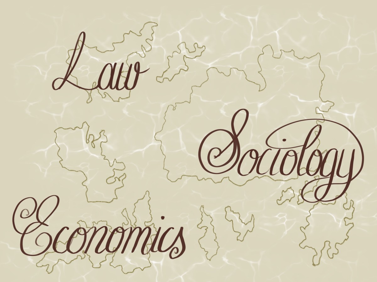
So, the Mountains of Metaphor project is a way for me to share my story and reach out. Maybe you’ve experienced something similar? Maybe you’re considering a PhD but aren’t sure how to approach it, mentally?

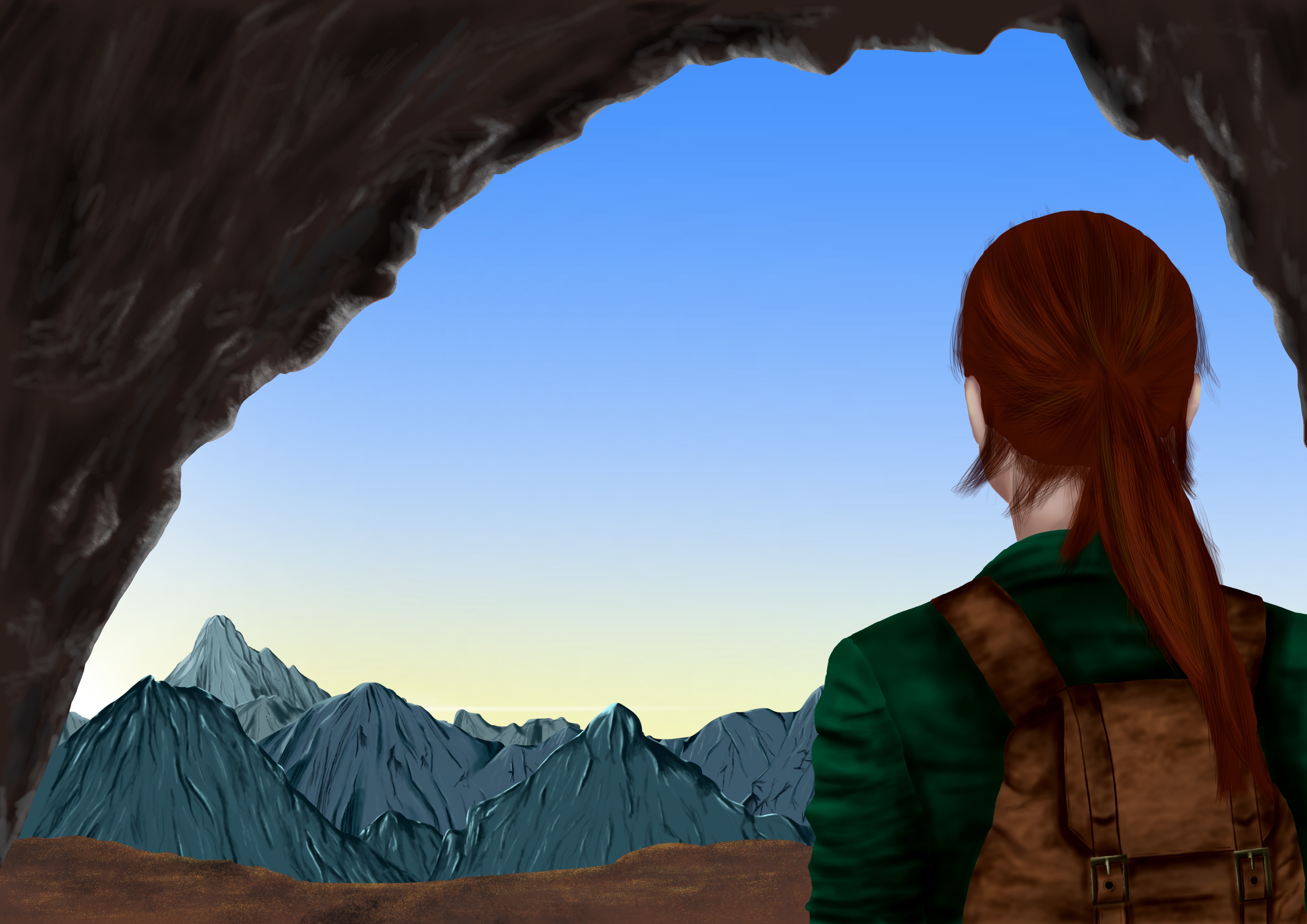
There are some supplementary materials on the site that you can download and play around with – why not try creating your own map of your research journey? Where are you on the map? What’s going on around you? Can you still see your eventual goal?

Why not send us a postcard from where you are?

Categories
economics Maps Research Visualising ESL

Maps and mapping…

Sean C Jackson is an artist who draws maps and mazes. The Guardian featured his work recently, and you can see it here. His maps are mostly imaginary, but ask the viewer to dive into the world he has created and puzzle through it. Most of the works sit somewhere between 2 and 3 dimensions, which can make for some disorientation at times, and asks you to engage with the work by turning either your head or the page.

Topography and mapping can be useful ways of visualising ESL, interactions, and social phenomena. Like a map, an ESL can highlight the relevant and hide the irrelevant. Like a map-maker, the researcher using an ESL must choose what is relevant and important and why. Like a map, an ESL lens can also zoom in on areas that are more important, while identifying but minimising others. As a result, we can appreciate the whole landscape in all its complexity and understand the context of the research.

If we were to map out current mainstream approaches in law, economics and sociology, how might it look? The picture below is a (stylised) suggestion that the academic silos of law, economics and sociology would look be islands of research endeavour. They are separated by sea, and generally have their own languages, cultures, and traditions. Some brave interdisciplinary scholars traverse the seas and work on two or more islands, but many do not.

Map of current mainstream disciplines
Current mainstream disciplines as islands of endeavour

How might it look if we were to draw an ESL as a response to these islands? Would they converge? Would we need bridges, ships, or loudspeakers? Would this enable inter-island dialogue, or just increase competition? And what could a map of the topography of ESL tell us about the lens?